According to wikipedia, the amount of unstructured data might account for more than 70%-80% of all data in organisations. Because everyone wants to find hidden treasures in these mountains of information, new tools for processing, analyzing and visualizing data are being developed continually.
This post focuses on data processing with R and visualization with the D3 JavaScript library.
Immutable images
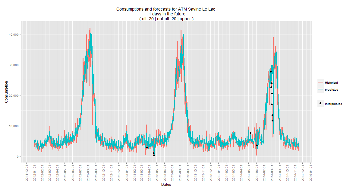
When using R for data processing, there are a couple of options to produce graphics within R itself. One of them is to use the R package called 'ggplot2'. This package makes it easy to turn data into beautiful charts. Consider the following chart, produced with ggplot.
As you can see, there is a lot of data on this plot, which makes it difficult to see what the values are at a specific point in time. Zooming in is not an option, because it's a static png-image. If we want more detail for a more specific time period to fit on the chart, we have to run our ggplot-scripts again with a smaller data set, which is not a flexible way of visualizing data.
Let's add some interactivity
When it comes to data processing, R is an excellent choice. When it comes to producing slick graphics, R is still a good option. But when you want to take data visualization to a higher level, you should start looking in other directions. That's where the D3 JavaScript library comes in.
To combine D3 with R, again you have a couple of options. It depends on whether
- R does the data and the graph rendering, then exports this as an SVG, onwhich you bind your JavaScript later or,
- R does the data processing and sends this data to JavaScript to create an SVGimage.
These two options are both valid if you have one-way communication (from R to a webpage with JavaScript). However, if you want two-way communication, meaning you can rerun R scripts based on input from a web application, you'll need other solutions like a Shiny webserver, or Rserve integrated with a webserver, or other types of interfaces. Two-way communication is beyond the scope of this post, so let's examine the one-way communication options.
First plotting, then binding
Let's try option number 1 first. We already showed how to use ggplot. Using R and the package gridSVG, the plot (with all it's data attached) can be transformed into an SVG element. Afterwards, we can start binding javascript to individual elements within the SVG. And here is the result.
Hover over the 'interpolated' points to see the tooltip. The process which leads to this result (explained here) requires a lot of manual work. We have to look inside the SVG code, to find the names of classes and id's where we can bind our javascript on. And that's only the binding. Again, this is not a very flexible approach.
There is a solution to this problem, and that is Plotly.
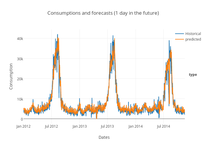
Plotly is built on D3 and they have done all that binding work for you. They offer multiple API's that not only work with R, but also with Python, Matlab, NodeJS and Excel. They also have an API especially for ggplot users, which makes it easy to extend our previous example. It works by uploading your ggplot (which also contains your data) to a repository on their servers. Afterwards, all D3 binding is done and you get a fully interactive plot that you can embed in any webpage:
 As a side note, you can't use the full spectrum of the D3 library with Plotly. It's only suitable for 'basic' charts and plots.
First binding, then plotting
Next, option number 2. Let's use R and Javascript for what they're both good at. R does the processing and delivers the data, which is used as input for JavaScript visualization.
To illustrate this, we start from scratch with a new example. We will be going through the 3 basic steps in data science.
- Get the data
- Clean the data
- Visualize the data
Number 1 & 2 are done in R, while number 3 is done in JavaScript. We'll be using data from this blog site itself to demonstrate this principle.
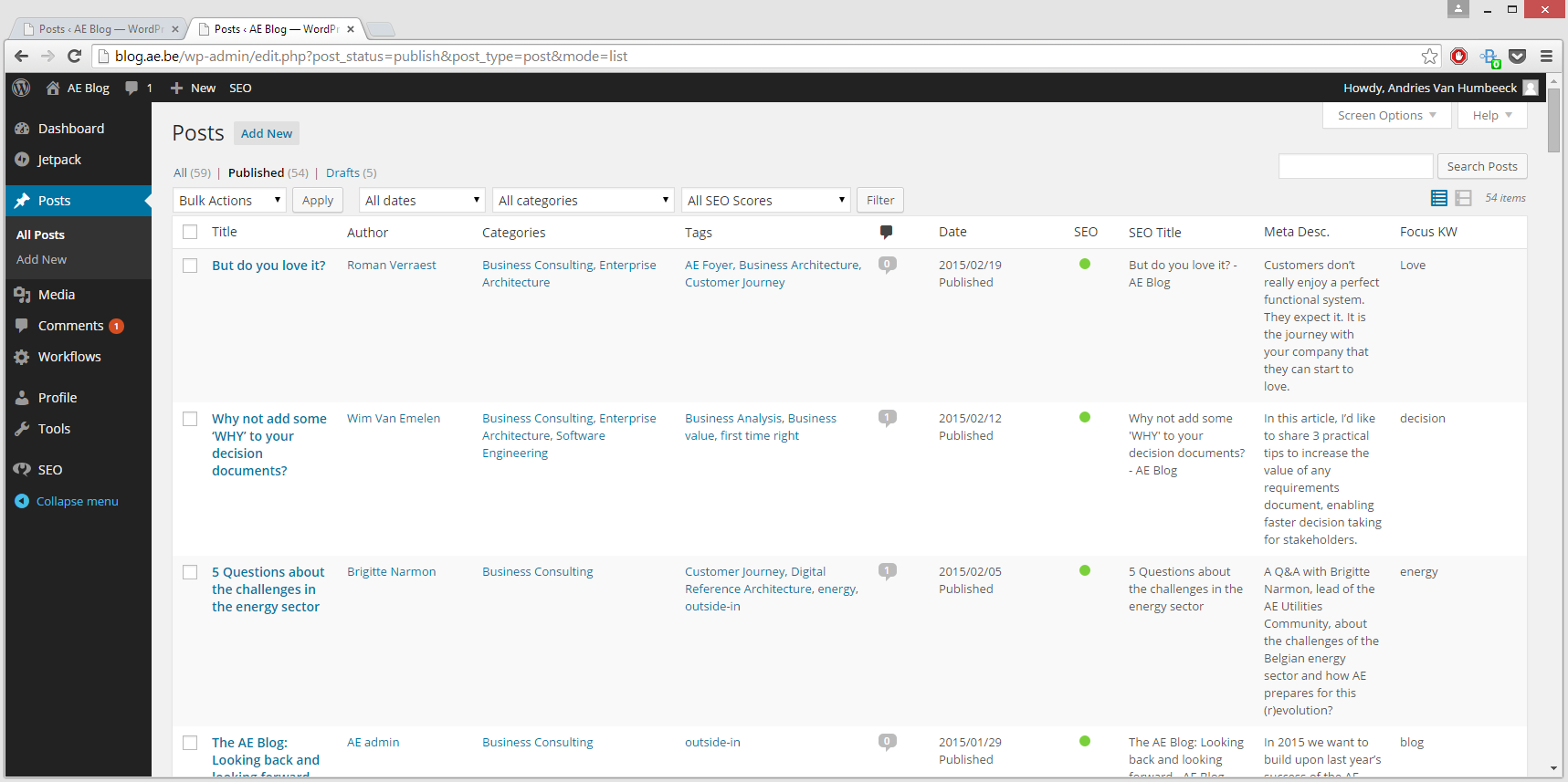
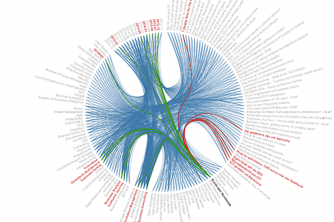
Looking at the html-page which contains all the info, we see that each row in the table has an author, a title, multiple tags, multiple categories, and a publication date. We can identify relationships between these entities. A good way to visualize relational data with D3 is the D3 bundle layout. If we want to use this type of visualization, we need to know in what format our data should be. We can see in the D3 code example where the data comes from: a JSON-file, which contains all relations between different elements, grouped by the type of element. Armed with this knowledge, we can start evaluating the 3 basic steps.
Step 1: Get the data
We get the data by scraping the html page which contains an overview of all blog posts. The blog-data in this webpage is structured in an html-table. R has packages which enable you to easily scrape the data from such a table. First we save this page as a static html page, so we can parse it more easily.
The code looks something like this.
[code language="r"]
library(XML)
# read all html table elements
raw <- readHTMLTable("WordPress.html")
# ours is the first of two tables
# in the html document
data <- raw[[1]]
[/code]
Step 2: Clean the data
Step 1 is done. We got our data. Next up is cleaning the data and storing it in the right format. We can determine the 'right format' by looking at the D3 code example. A JSON-file is used as data-input for the visualisation. This JSON-file should contain all relations, for each single element. The end result should look something like this:
[code language="javascript"]
[
{
name: "Title.But do you love it?",
size: 0,
imports: [
"Author.Roman Verraest",
"Categorie.Business Consulting",
"Tag.AE Foyer",
"Date.2014-12",
"Tag.Business Architecture",
"Tag.Customer Journey",
"Categorie.Enterprise Architecture"
]
},
{
...
[/code]
To achieve this result, we can use R to reorganize the data. R has some packages that can help us achieve this. For example, the package 'reshape' helps to reorganize tabular data, or the package 'RJSONIO' which serializes R objects to JSON. After some more R magic, the data is cleaned and in the right format.
Step 3: Visualizing the data
This JSON-file, containing all data, is accessed by D3 as follows:
[code language="javascript"]
d3.json("input.json",function(err,classes) {
...
});
[/code]
Simply plugging this data into this code example gives us the final end-result: a fully interactive D3 graphic (screenshot below). Move the mouse over the text to see all relations among the different entities.
Final notes
There is still much more to be said when it comes to integrating R and D3. This post just scratches the surface. Projects like rCharts and clickme or visualizing ggplots with Shiny and D3 are all different approaches to combining R and D3.


